Fixing mobile pages that break in Facebook & Instagram’s In-App browser
Aug 18, 2025 / wix
I recently launched a new website for my wife’s business — shefikarni.com.
I built it on Wix. The site looked great, and we decided to promote a local event she’s hosting for pregnant women. I set up a Facebook campaign and a dedicated landing page where women could learn more and reserve a spot.
Just before going live, I sent the post to a couple of friends for review and got worrying feedback: on some Android devices the page looked “off.” At first I thought it was only one device (especially Google Pixel phones), but it turned out not to be limited to those.
The problwm was that elements were getting pushed on top of each other. Images and text weren’t staying where they should. In Chrome DevTools everything looked fine at different breakpoints, but the screenshots I got told a different story. In one example, text was pushed up over other text; in another, a button and a paragraph had slipped out of place.


Why this was happening
After a few days of digging, I found the issue: Android’s “font boosting” (system font scaling). Users can increase text size in Android settings, and in-app browsers can honor that setting and override your CSS. So when a Wix page opens inside a social app’s in-app browser, if the user has larger text enabled, your site’s text can grow beyond what your layout expects. I recorded a quick before/after on my phone to show the difference.
How I fixed it
The most important thing for you to know is that you can’t simply drag and drop elements on the page. You must be clear on what is their parent element and where are they located in relation to it.
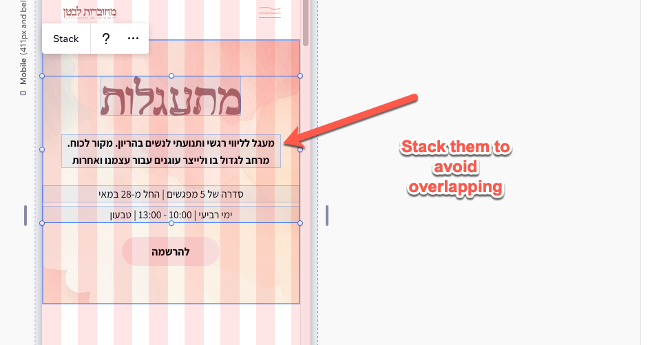
For examples, don’t just drop text one below each other, instead stack them together.
In this example, I discovered that I need to stack the text in the header under one div:
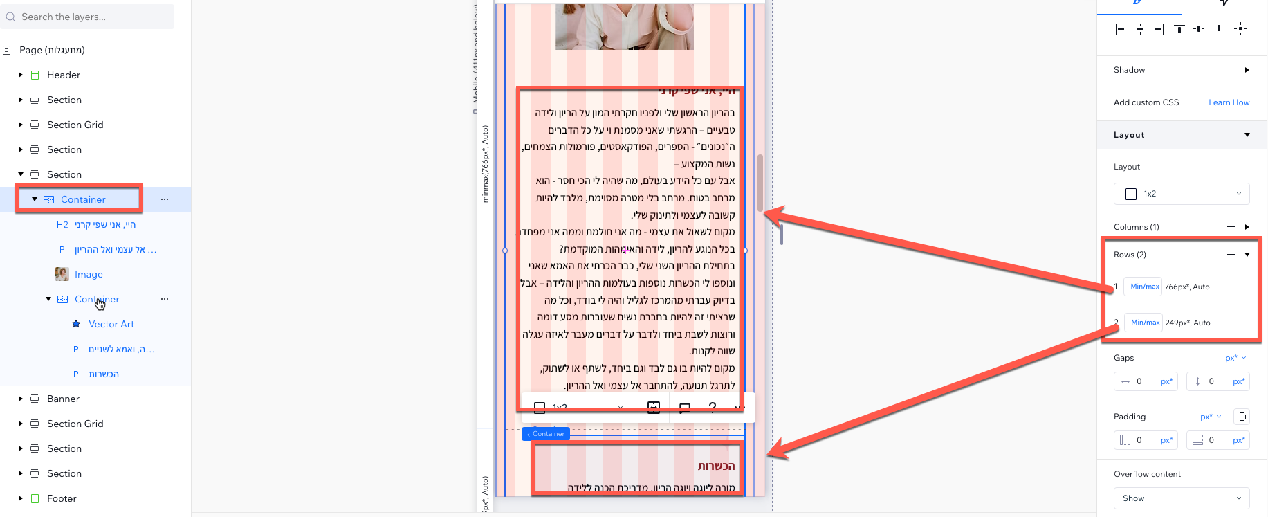
In other places I assigned content to be on different"rows" which stopped them from overlapping:
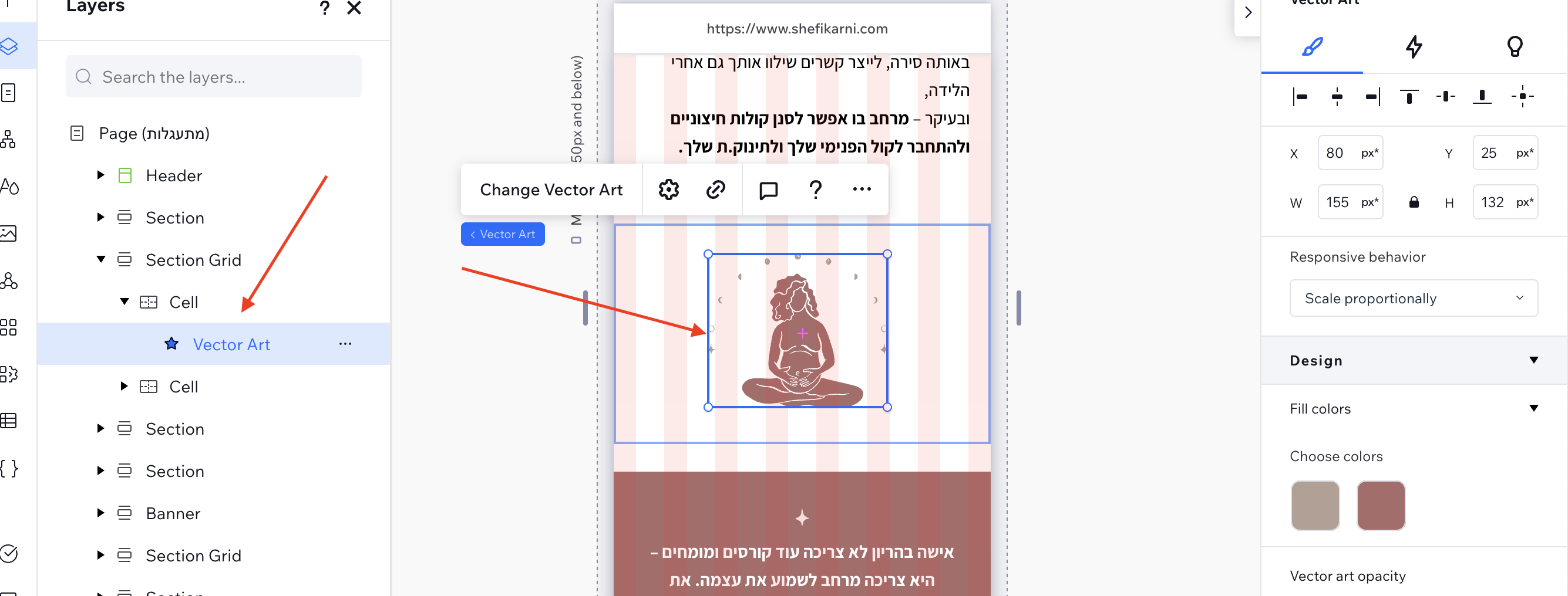
With images, instead of dragging and dropping an image onto the page, I placed it inside a grid cell. That way the image can’t float around when things change the spot is clear and locked.
Takeways
- Android’s font boosting was overriding my CSS in in-app browsers like Instagram and Facebook.
- Drag-and-drop is great, but for a bulletproof mobile layout you must be explicit about where elements sit and who their parent is.
- Nest elements inside rows and grid cells so the hierarchy is clear
- Always get a second pair of eyes before you push a campaign live!
Huge thanks to the Wix support team for helping me make sense of all this. I worked with a couple of folks there for a few days until we figured it out. They were incredibly helpful and didn’t rest until we all understood what was happening. And a special shout-out to Stefano from the Wix QA team, who pinpointed the Android feature behind the issue.